Are You Still Decorating with Outdated Jewel Tones?
Uh oh, did you just say to yourself: “There are new jewel tones”? If you did, then read on to discover one of the hottest color trends in interior design.
If you are like me and old enough to have been decorating your own home since the early 90’s, when you hear “jewel tones” very likely a specific image comes to mind. And even if you weren’t a grown up yet, your mom probably had rooms designed around these particular jewel tones. Let me describe them for you. Imagine, lush forest green, deep rich burgundy combined with a sort of midnight, navy blue, all layered on a palette of warm yellowy neutrals of golden wheat and harvest gold.
Do you remember it?
Not sure, well it looked like this:
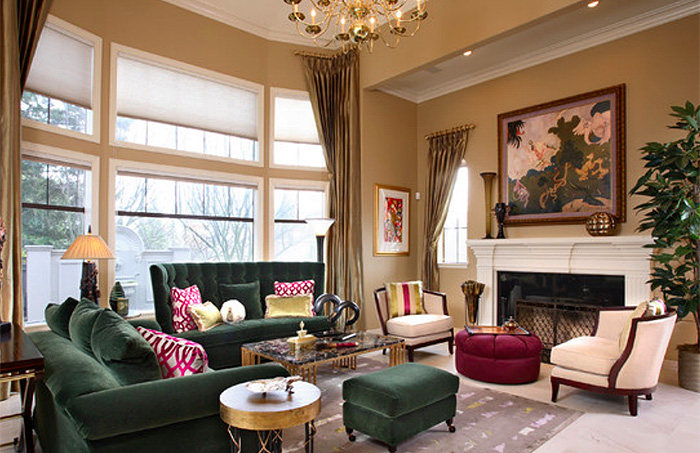
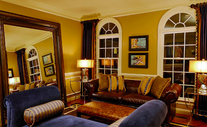
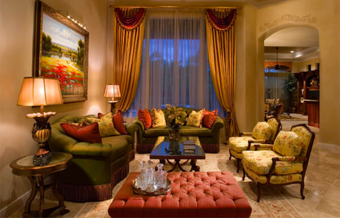
All are beautiful rooms, no doubt. But, they’re done, yesterday’s news. It’s a new world out there and the jewel tones of today are fresh and dynamic.
Allow me to introduce you to the new jewel tones!
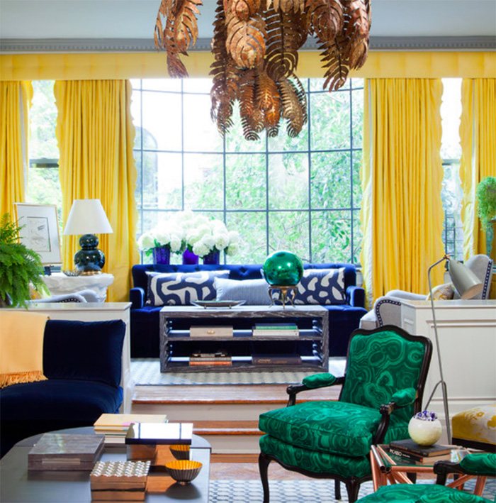
The greens are now clear and bold, like this emerald green in this fabulous living room by Sally Wheat Interiors.
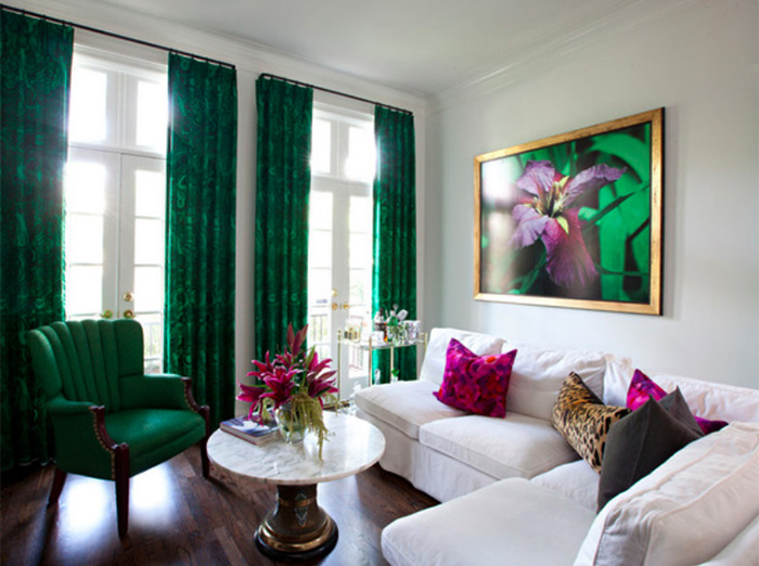
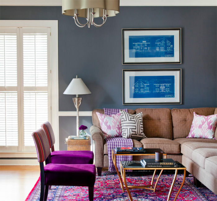
Andrea Brooks Interiors uses lively purples and fuchsia to replace stale burgundy and merlot.
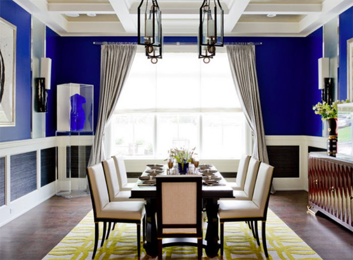
An intense royal blue sidelines tired tones of traditional navy blue in this dining room designed by Richard Mishaan Design
Finally, notice two additional tweaks. First, scroll back to the above pictures again and notice the background templates are all fashioned on cooler tones. Hues of gray and taupe are on the table, charcoal, pewter, greige, you name it, and it works. 86 the yellow tones of wheat, tan and harvest gold.
And now take a look below; see how bright pops of high contrast colors dot the palette adding drama and spark.
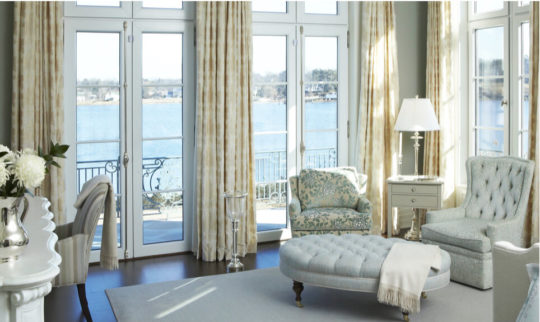
Brilliant yellow drapes surprise and captivate in this room by Amanda Nisbet
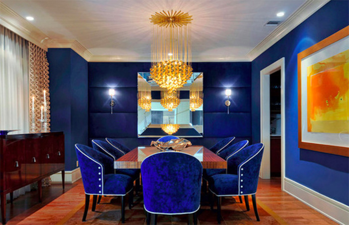
Fiery orange in the artwork heightens the drama in this dining room by Carolyn Miller Interiors
Crimson red energizes the neutral taupe and metallic in this master bedroom by Mia Karlsson Interior Design.
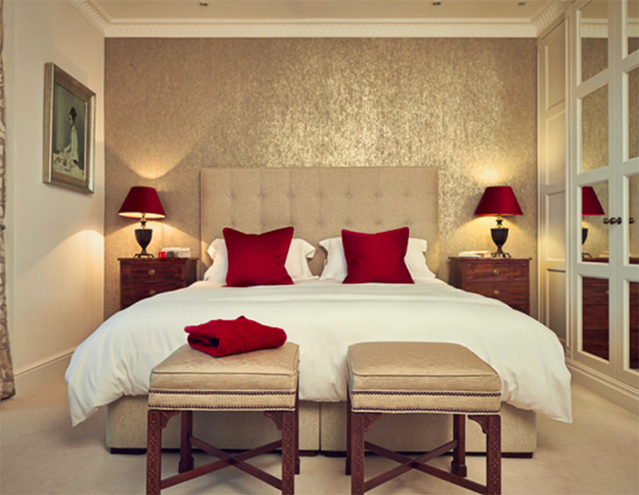
Complete your room with some stylish accessories, lamps and tables in shiny metallics like silver, gold and pearly opalescent and you will have created a beautiful room just like a pro interior designer.
Do you have questions on how to decorate with the new jewel tones, let us know, we’re here to help!


Jennifer
| 1 September 2023Yes – the Hunter Green and Burgundy of the 1990s is out – but I have a strong feeling that those decorating with a jumble of colors will live to regret it. The yellow-draped room above screams “Carnival” or 1960s – and in the decades that followed that kind of kooky flamboyance was downright embarrassing to look at. Like the 1960s, today’s bright, bold colors is taking its cues from youth – specifically the design style called Grandmillennial. There’s a lot I love about this trendy new take on traditional designs – especially the way it has invigorated staid, old use of vintage furniture. I’ve always found a neutral palette bland – and am looking forward to dabbling in textiles in deliciously saturated hues. Yes – I said “dabble” – because past experience informs me it’s best not to gorge oneself on every shade in the rainbow. The the new jewel tones strike the most elegant note when shining as solo notes in an otherwise more refined room (see the taupe room, above), or when paired with its contrasting shade on the color wheel (as in the emerald room with fuchsia touches). If you use more than 2 strong colors, your room risks losing its character to the colors – no one will appreciate the design elements any longer as color competes for attention (I’m looking at you, Yellow Drapery Digs!!!)